
CREATING THE VISUAL IDENTITY
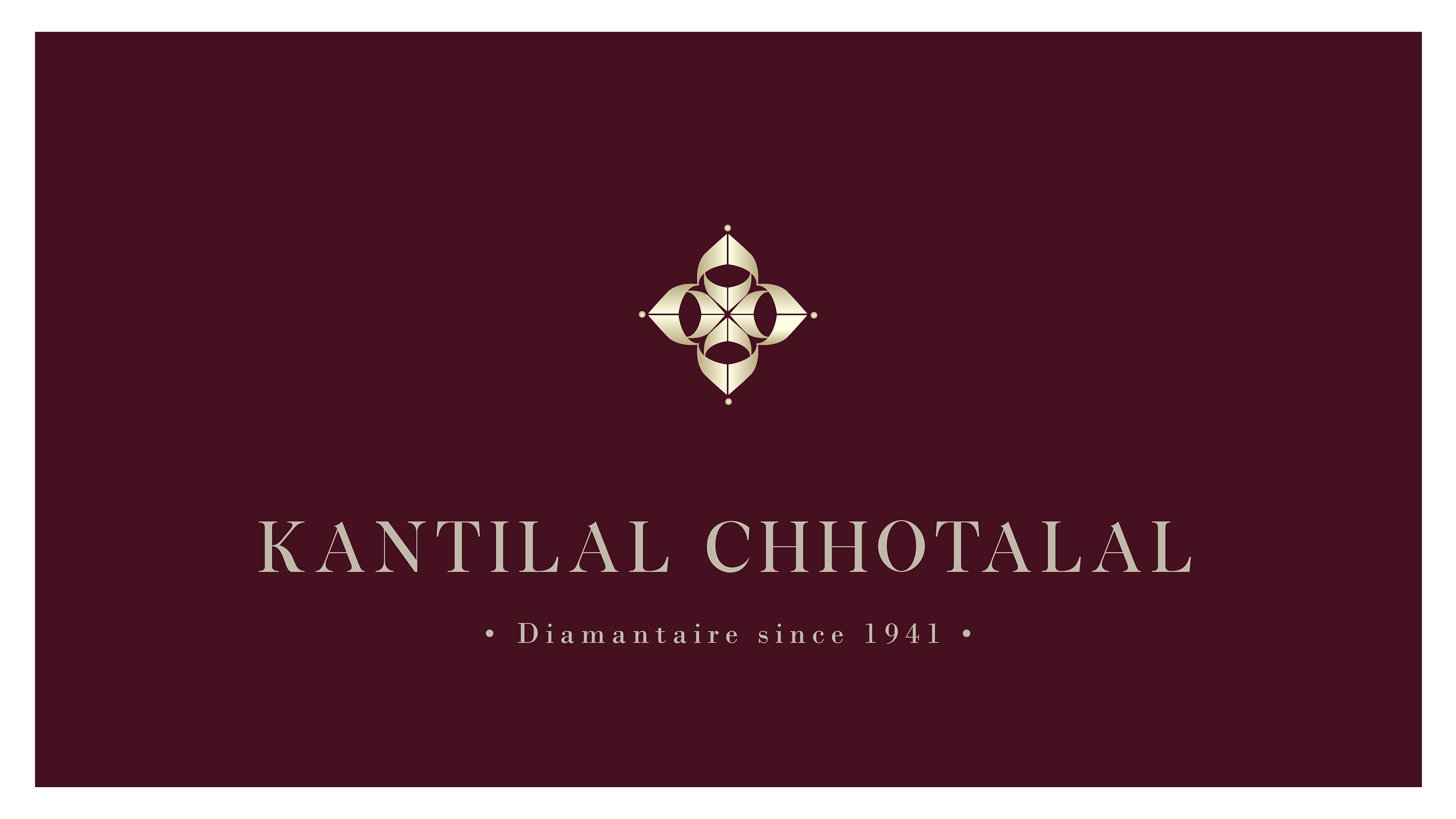
Kantilal Chhotalal is a producer of diamond jewelry for the premium Indian market.
The identity is a result of an abstraction & repetition exercise from alphabets K & C. The form created is inspired from the "sparkle" of a diamond, graphically represented. The four dots on the edges reflect the technique of diamond setting where-in, one can see the prongs holding the diamond in place in a framework of metal. The form is versatile as it can be expanded in numerous applications. It truly looks like a piece of jewel, hiding the secret of KC in plain sight, delivering an elegant inherited visual to the audience.
The colours deep burgundy and subdued gold were selected to reflect the company's heritage as well as their place in the Indian jewelry market.
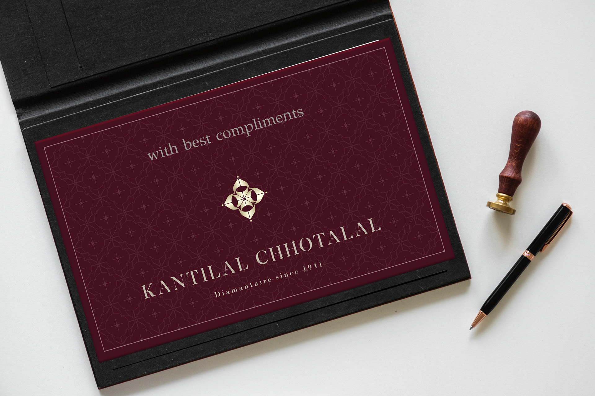
Some patterns created for the brand, which will later be incorporated into their stationery, alternative textures for product packaging, for visual merchandising and in-store display. Here, I play with the tessellations for short videos.