The peaceful energy in the colours of the sunrise are the source of inspiration for the primary colour palette. The secondary colours are inspired from sophisticated luxury.
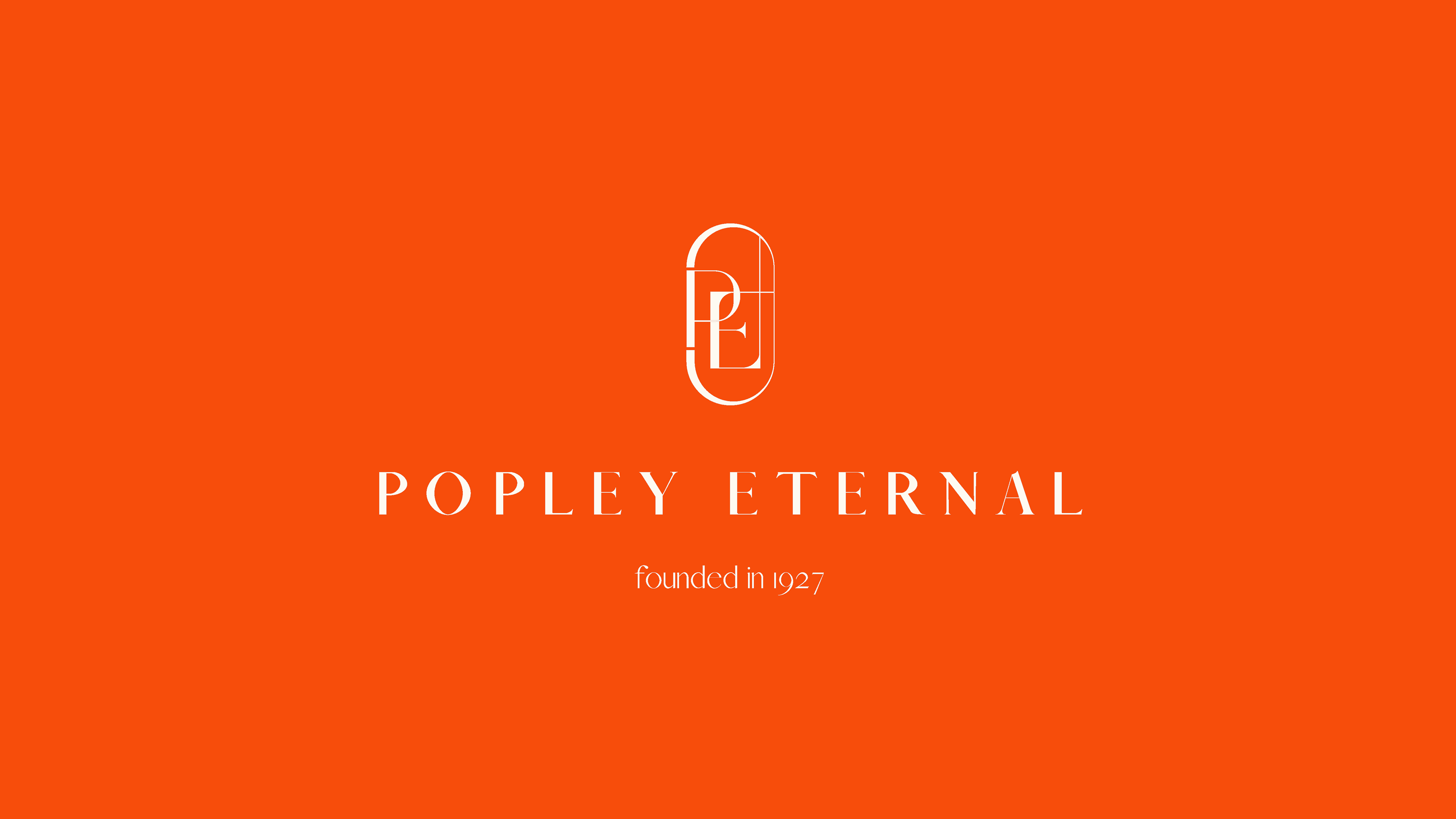
The contrast between the different weights of the lines make it playful, elegant and modern. The intertwined P and E form a close bond between the past and the future. The interconnected lines bring an interesting extension, which is held together in the capsule.
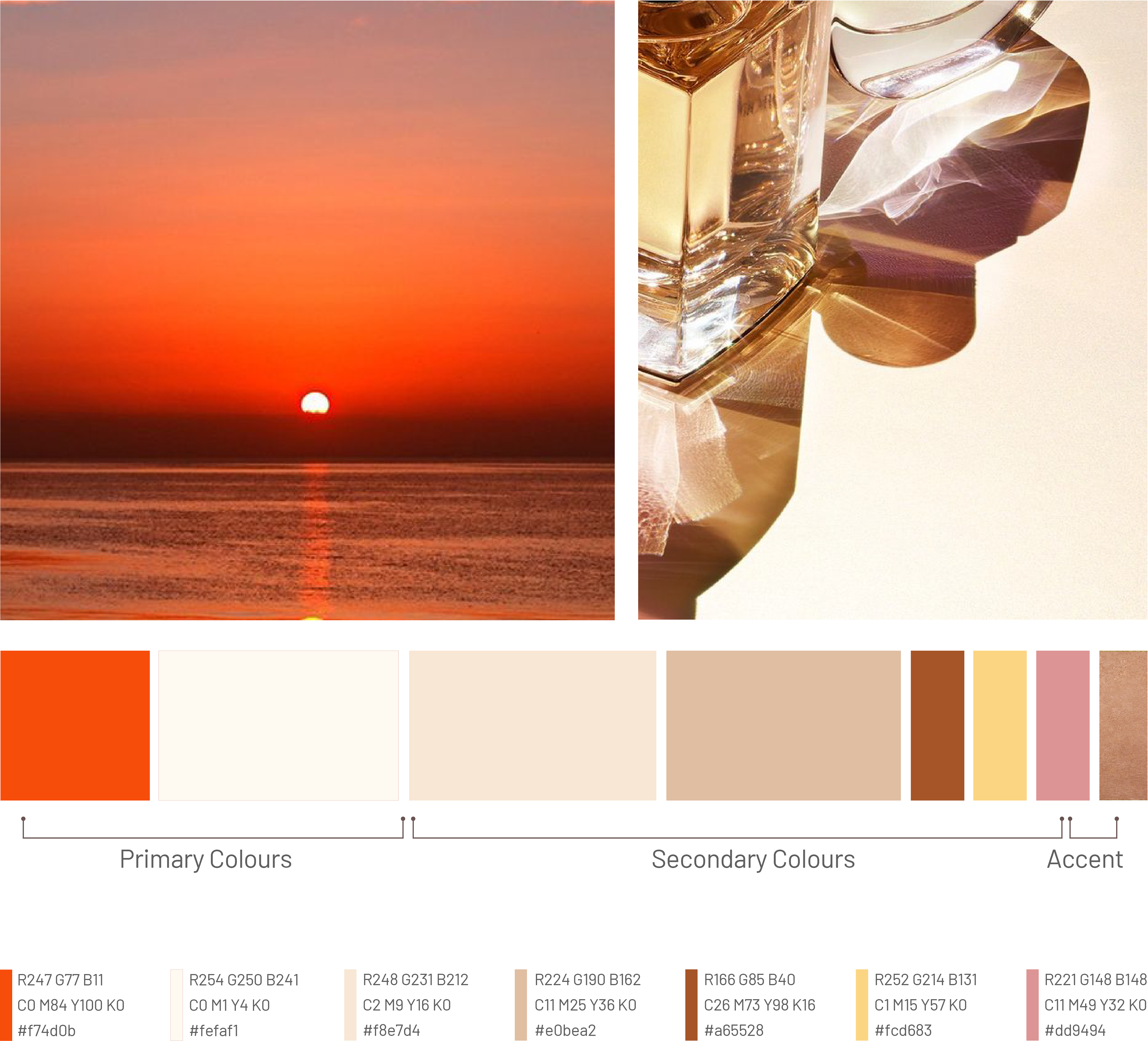

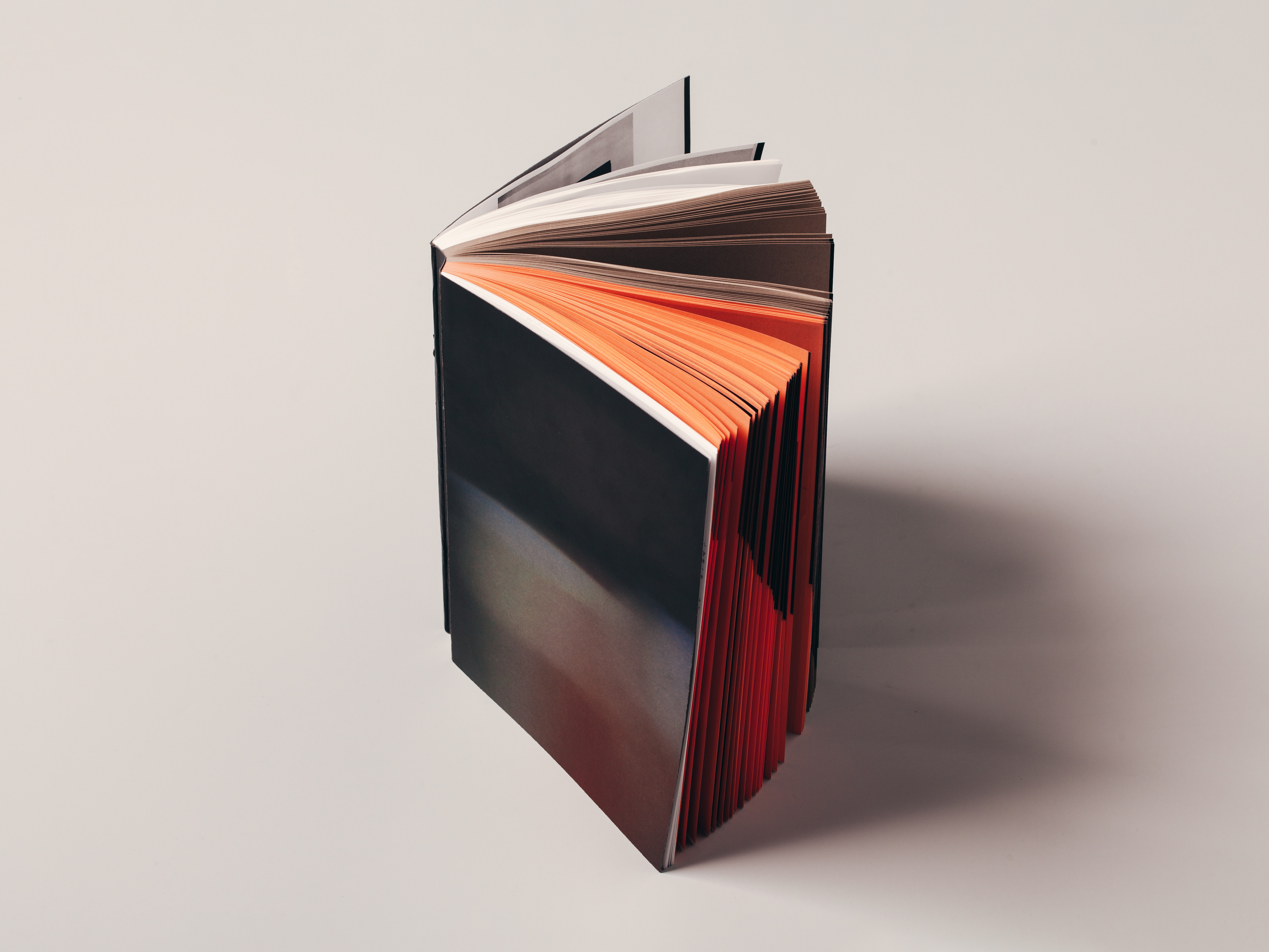
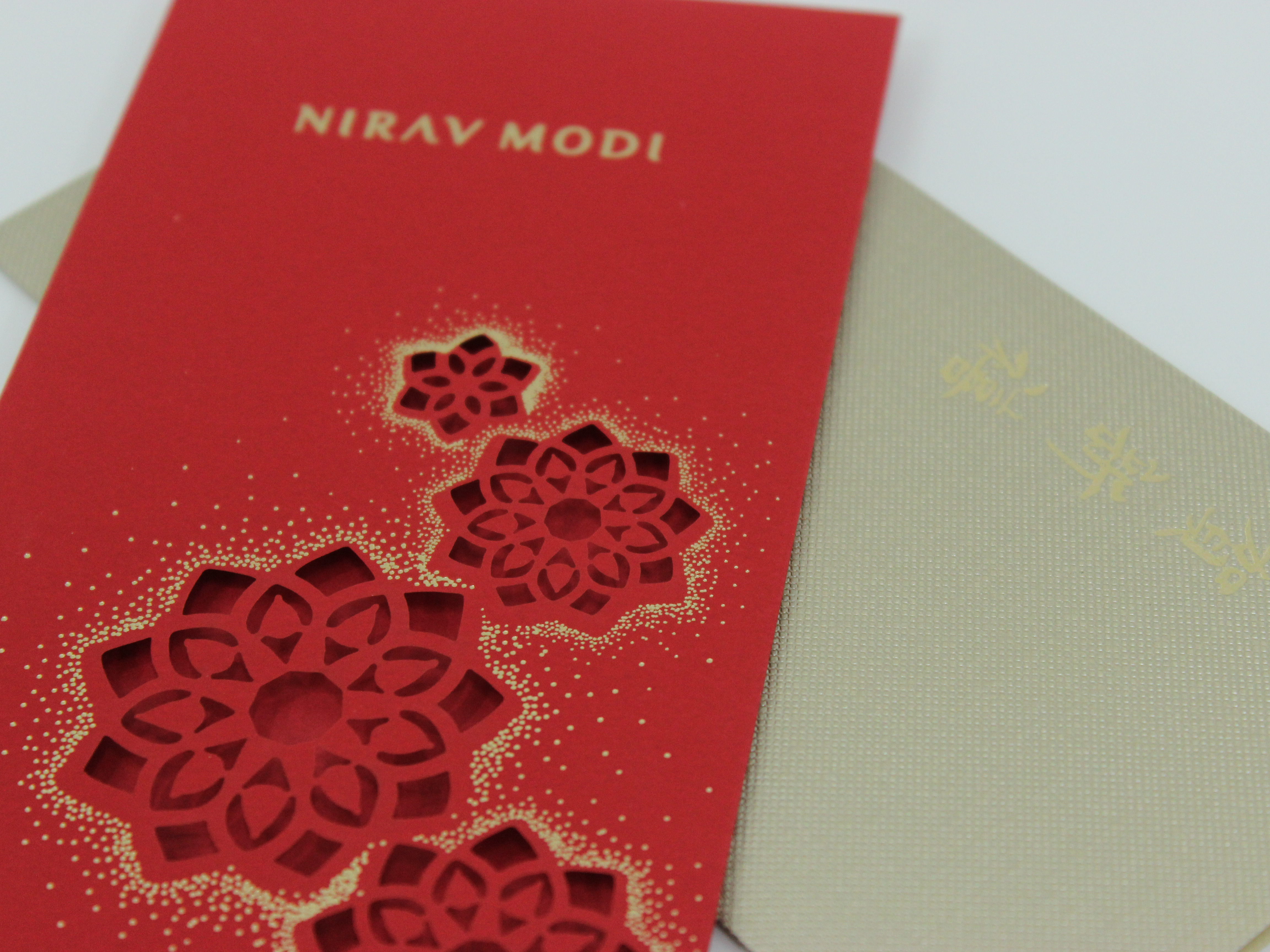
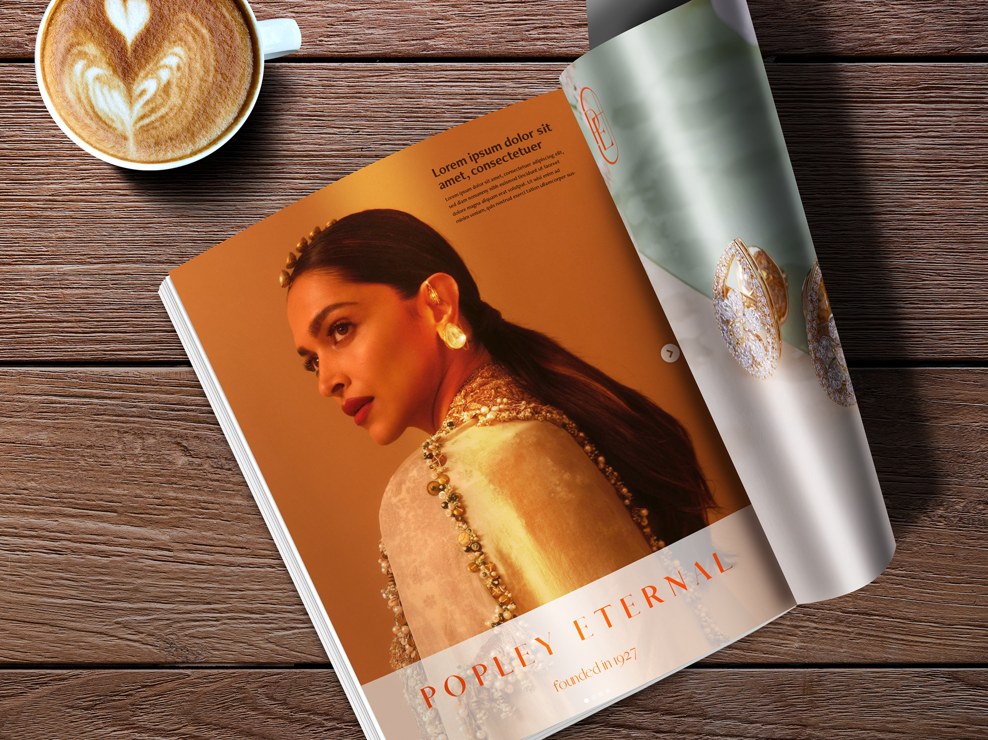
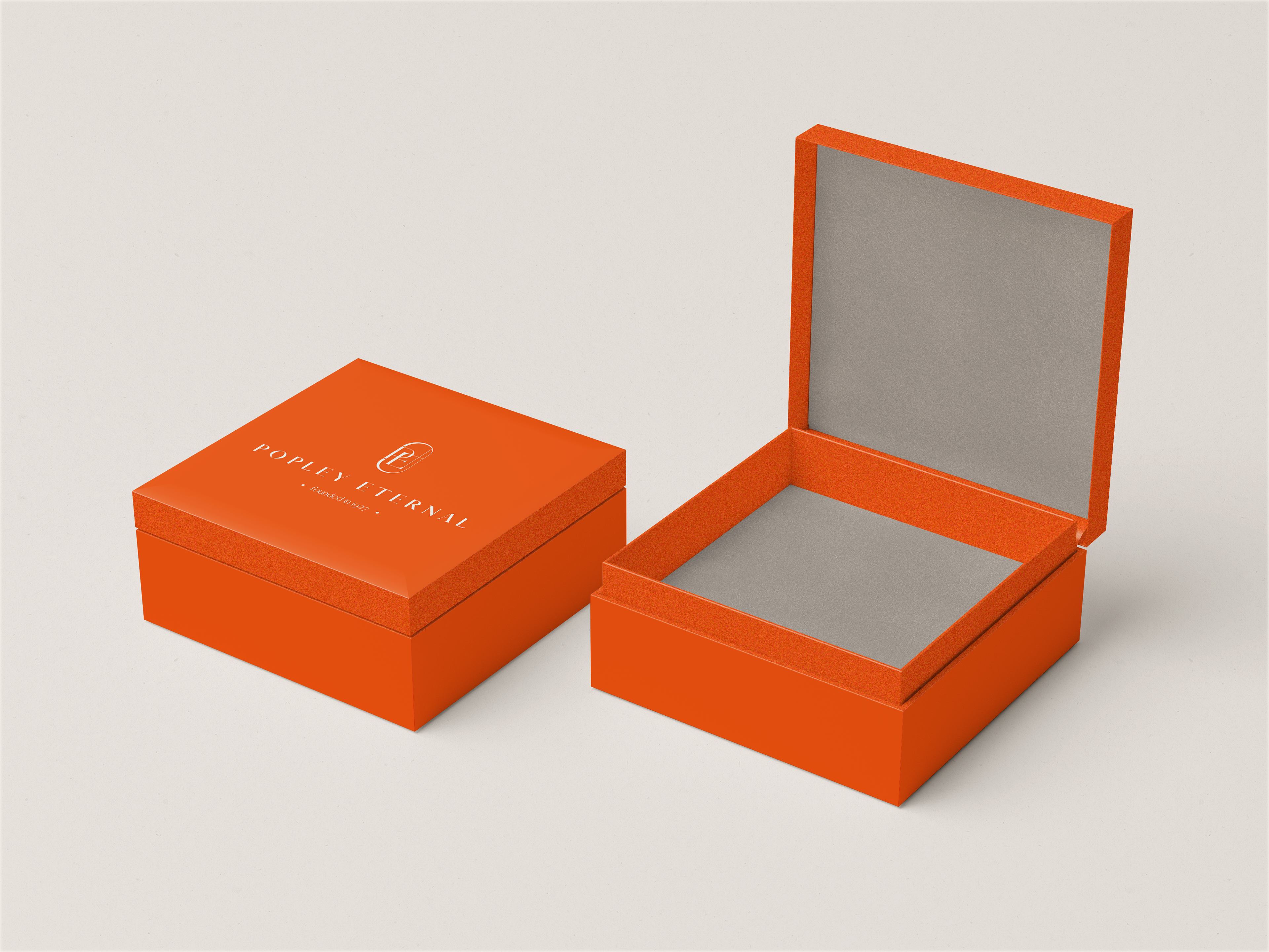
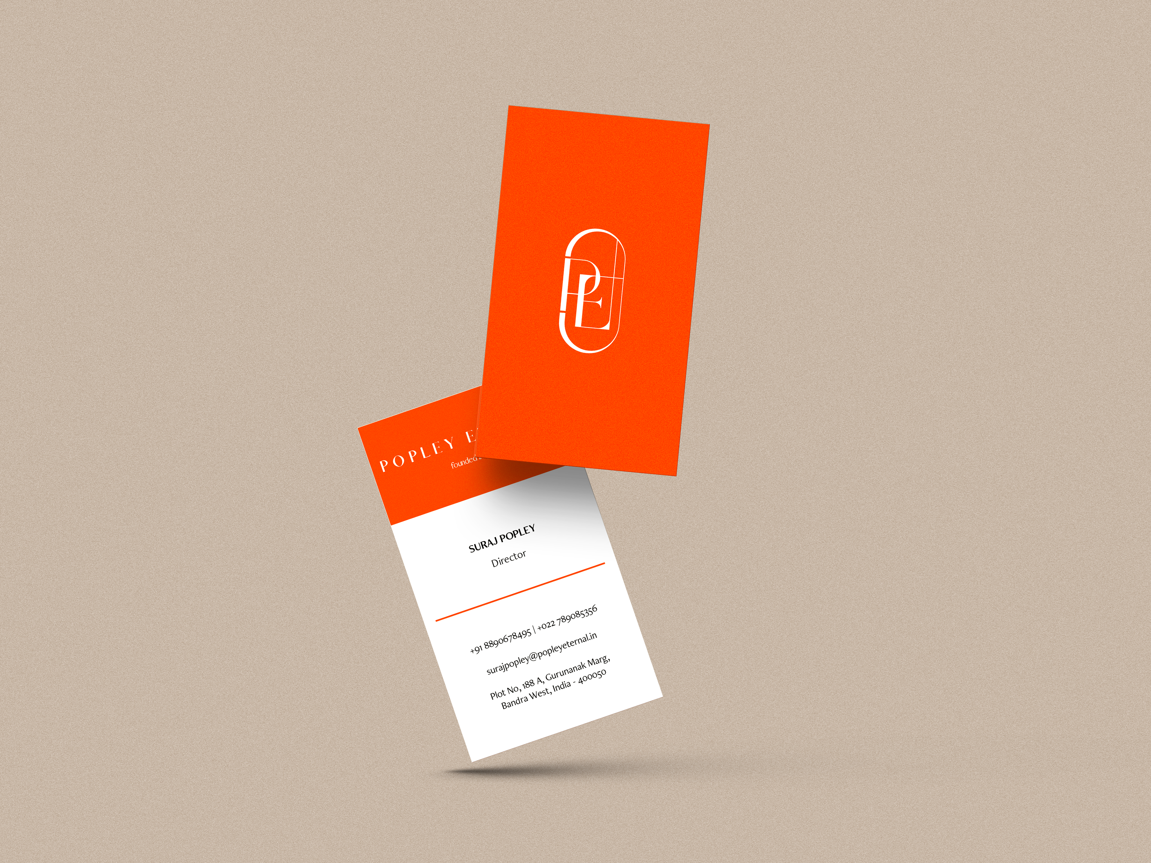
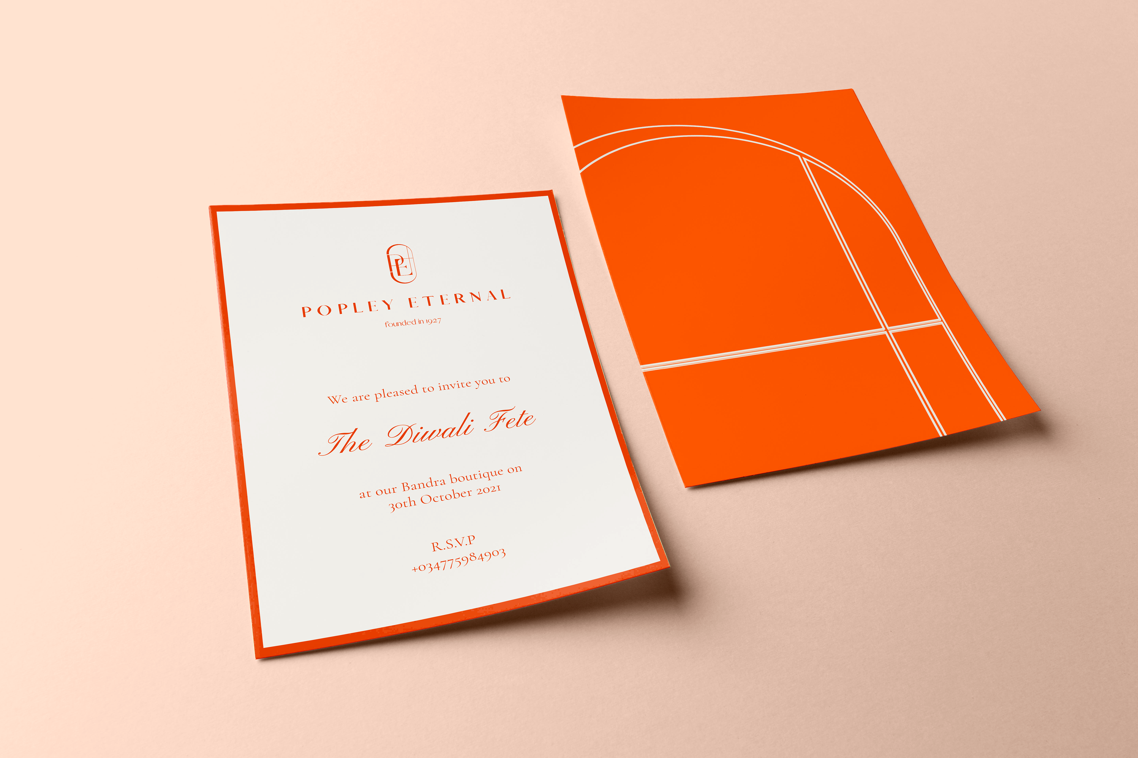
The primary colours comes alive in key brand communication. The secondary colours take the lead when it comes to photography, ambience, backgrounds and such. Together, it is always a complimentary relationship, as seen below in some of the visualisations of digital, print & packaging expressions of the brand.

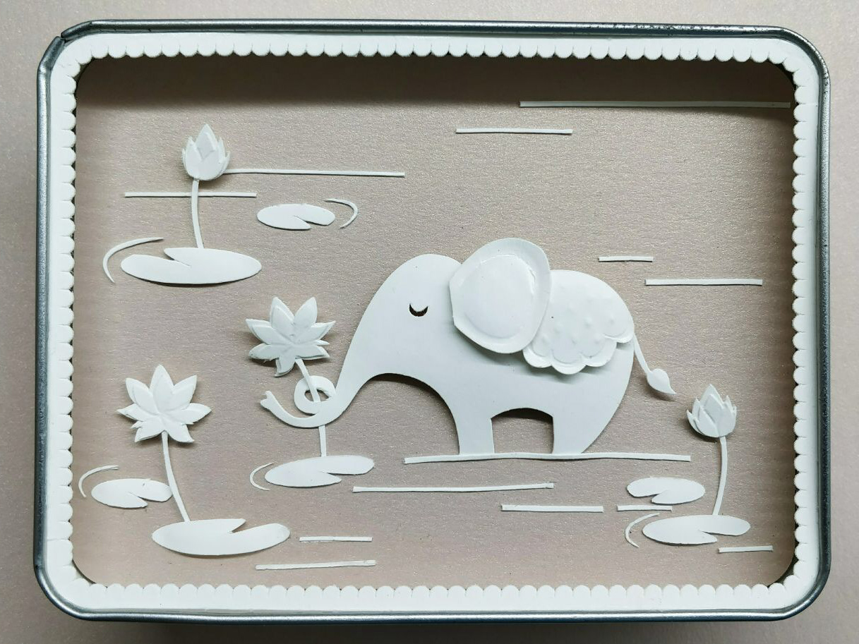
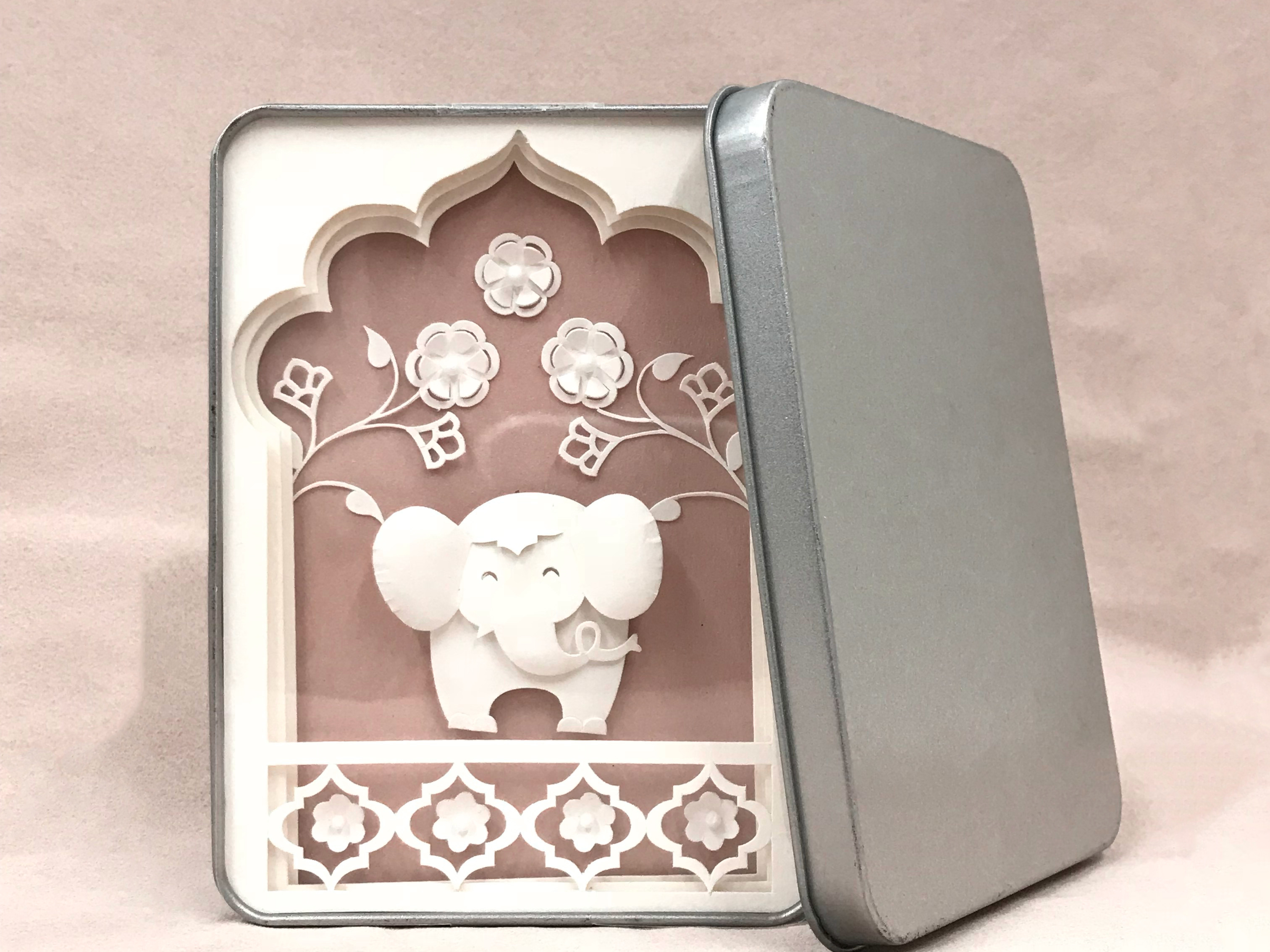
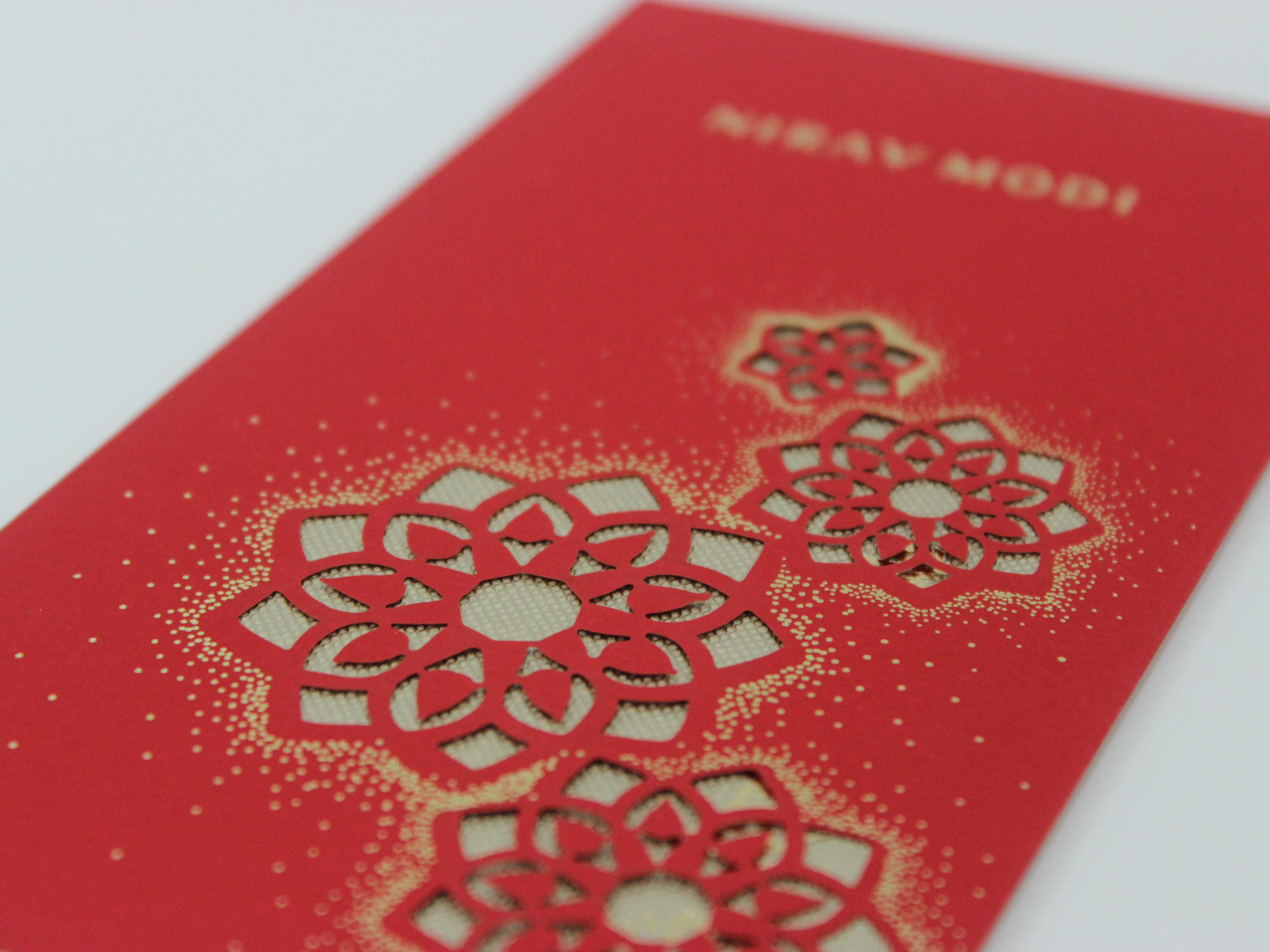
And now, some real-life applications of the new identity incorporated in the store (independantly by the PE team)