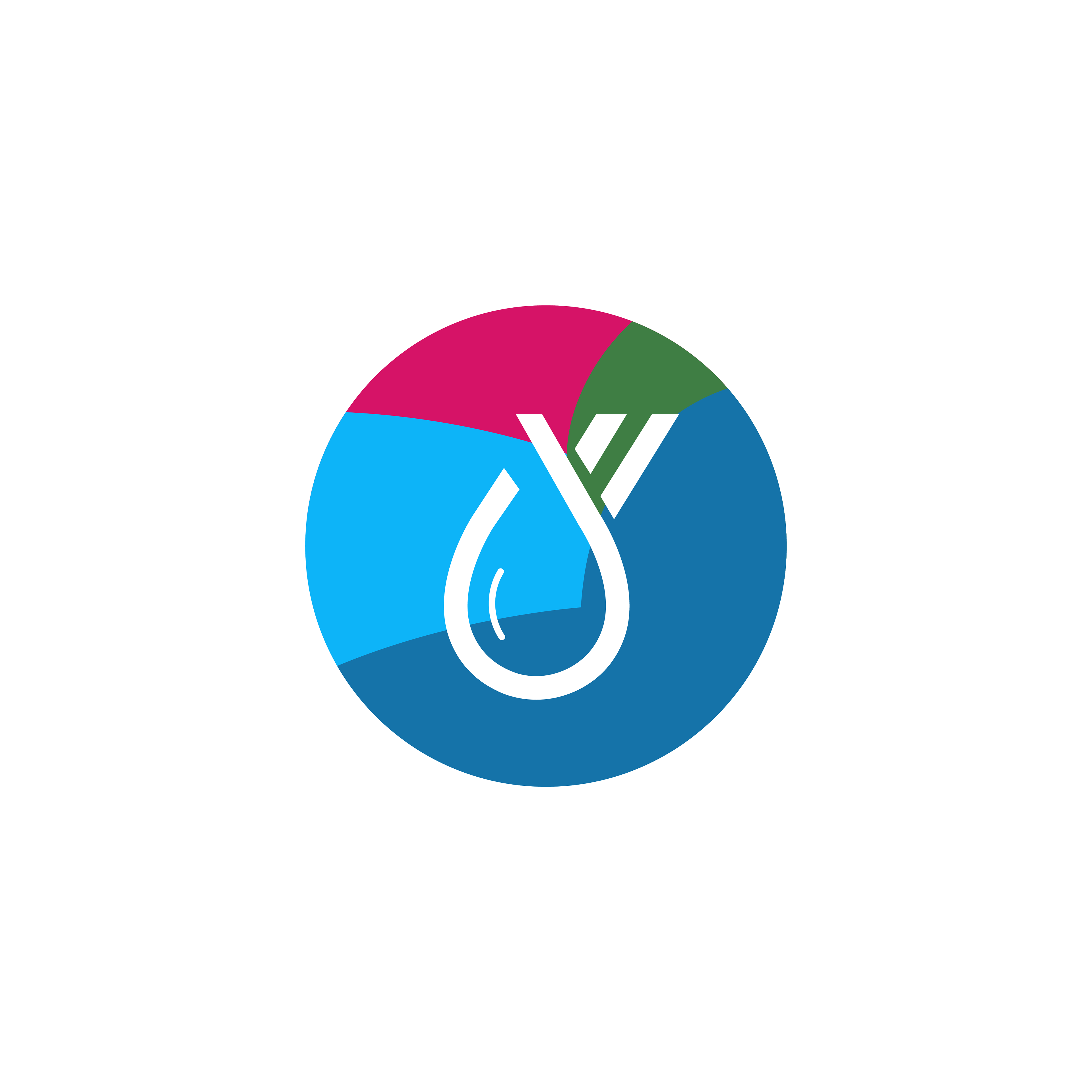
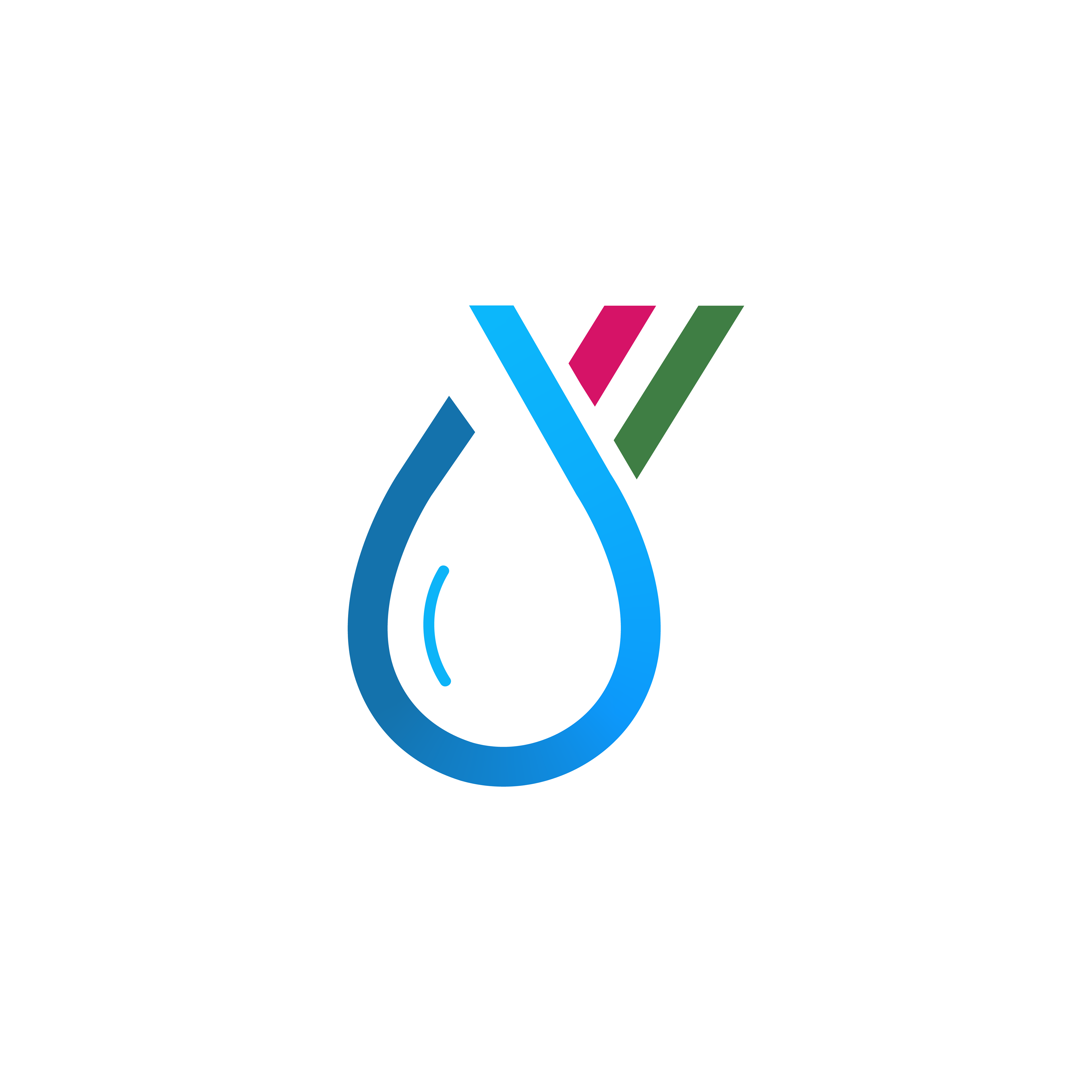
YWATER is an organization based in Mumbai which champions youth engagement in driving sustainable water and sanitation solutions for India. The identity comes from a water droplet which has an opening at the top, expressing the fluid quality of water. It is structured around the alphabets Y and W. It is encompassed within a circle with overlapping colors defined by the SDG 6.
The aim was to create a visual identity which reflects the positive energy & serious commitment of the wonderful team towards a sustainable future. It is minimal, yet bold. It takes up space & embraces an inclusive environment. The logo is an extension of the same idea. The little stroke in the negative space of "a" creates a water droplet, in a subtle yet impressive manner.


As the creative advisor of the organization,
I work with the team to visualize the research
and impact by the team on ground, to reach
audiences across the globe.
We aim to create a community to reflect the
fresh stance YWATER brings to the issues.
Creating a holistic, positive and impactful language is a continuous project for the team & me.